In our ever-evolving journey to “empower the doers”, there are moments that stand out as milestones—moments that reflect not just progress, but the culmination of dedication, collaboration, and a relentless pursuit of serving the deskless workforce. Today, we’re thrilled to announce one such moment: Manifest 3.0. This release introduces important functionality to enable the management and control of the publishing of new digital procedures within an organization and enables the highest levels of compliance, traceability, and accountability – capabilities well-suited for highly regulated industries and valuable to larger enterprises and teams.
But this release isn’t just a product of our hard work—it’s a testament to the invaluable feedback and support of our customers, whose insights have been instrumental in shaping our journey towards innovation. For months, our team has been hard at work, fueled by a shared vision to deliver an update that empowers workers to do their jobs better while providing their organizations with new tools to manage and orchestrate the use of Manifest work instructions. Every line of code, every design iteration, and every late-night brainstorming session has been informed by customer feedback and infused with a singular purpose: to create an invaluable operational tool for the deskless worker.
Manifest 3.0 introduces new features and significant enhancements for all Manifest applications including our popular iPad app, Manifest Maker. Highlights include:
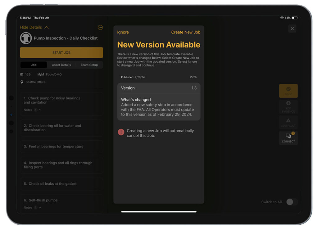
Editorial control and versioning of Manifest Templates
As larger organizations deploy Manifest with more users and documented procedures, customers have been asking for more controls. So, we’ve introduced new user roles, logic and workflow to manage and publish new Manifest work instructions, control what version is used in production, and archive version activity and history.
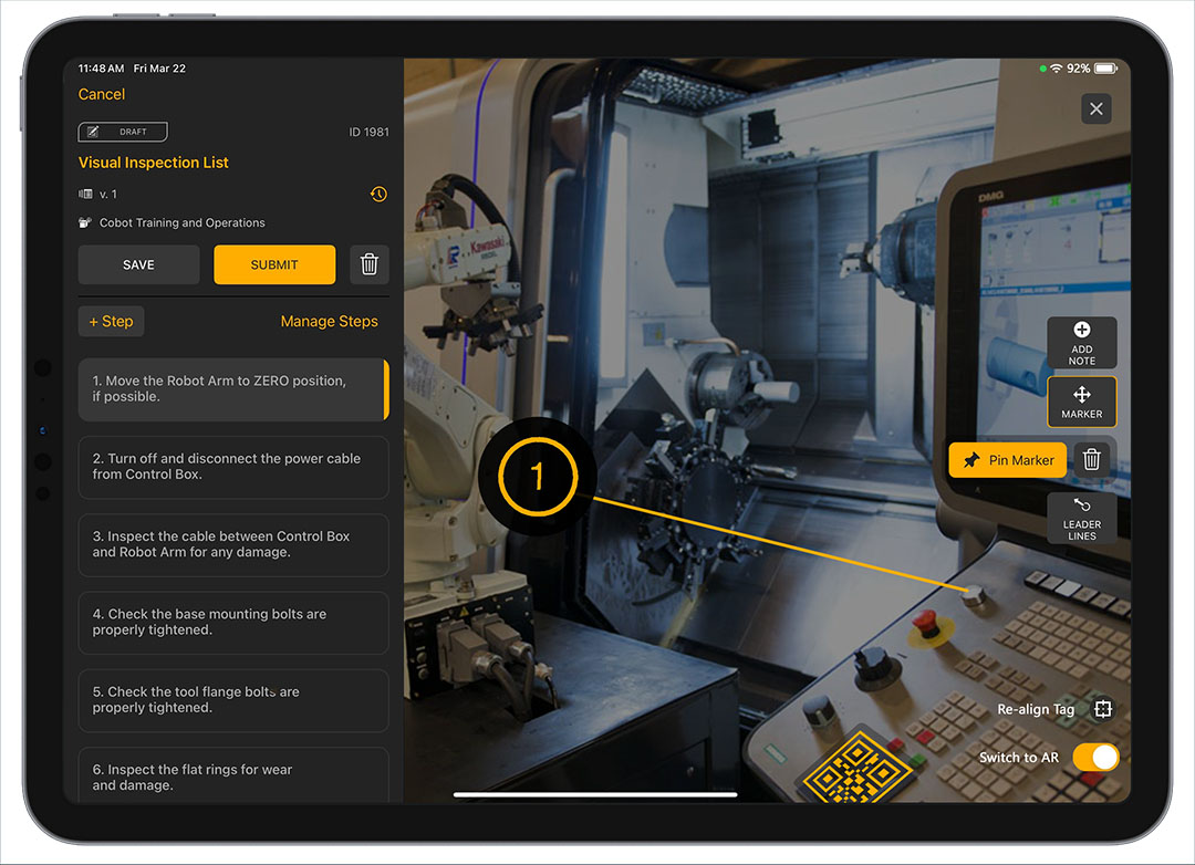
Manifest for iPad authoring and UX enhancements
Being a familiar, cost-effective, and AR-capable device, the iPad is increasingly being used by customers to scale Manifest deployments. It’s also a great place to start with Manifest. So, we refreshed its user interface to improve usability and added more intuitive AR authoring tools, new ways to manipulate AR Notes (previously known as Pen Notes) and a design like the Job interface which creates a seamless experience across creating, viewing and performing Jobs. There is also a new default screen that provides workers with faster access to their assigned work.
Refreshed experiences and capabilities for Manifest Web Application users
The Manifest Web Application continues to be a vital tool for Manifest Admins as well Authors creating a larger number of work instructions or documenting more complex digital procedures. To streamline navigation and make important information more discoverable, we have modernized its design and updated the color palette. We’ve also reduced the number of pop-up modals to decrease required clicks and provide breadcrumbs to facilitate navigation throughout the app.
Enhanced Manifest 3D UI
Our Manifest app for XR-enabled headsets also gets a refresh with this update. We have simplified and streamlined the heavily used, main navigation menu, provided larger tool tips for new users, and refreshed Work, Location, and Asset listings to better highlight Manifest Work items and information. Together, these enhancements provide a refined, polished, and easier to use interface for our users.
These are only the highlights and there is a lot more. To review more details of Manifest and our suggestion for updating your existing Manifest users, please see the links below:
Manifest iPadOS 3.0 Release Notes
Manifest 3D for HoloLens 3.0 Release Notes
Manifest Web Application 3.0 Release Notes
We are excited about Manifest 3.0 but more excited about how our customers and partners will use these new digital procedures and benefit from it. As we celebrate this milestone, we reaffirm our commitment to serving the deskless workforce and empowering the doers. Thank you for being a part of this journey. The best is yet to come.


